

Anomaly vii, 68x27 inches, limited edition of 12

Anomaly xvii, 60x40 inches, limited edition of 12

Anomaly v, 48x33 inches, limited edition of 12

Anomaly i, 68x27 inches, diptych, limited edition of 12

Anomaly iii, 65x48 inches, diptych, limited edition of 12

Anomaly ii, 68x48 inches, diptych, limited edition of 12

Anomaly iv, 68x48 inches, limited edition of 12

Climate Graph: surface temperature recordings in Nepal from 1901 - 2021. Source: Ed Hawkins, National Centre for Atmospheric Science, University of Reading.

Anomaly xi, 48x32 inches, limited edition of 12

Anomaly xii, 24x24 inches, diptych, limited edition of 12

Anomaly xiv, 36x36 inches, limited edition of 12

Anomaly x, 48x32 inches, limited edition of 12

Anomaly xv, 40x30 inches, limited edition of 12

Anomaly viii, 60x45 inches, limited edition of 12

Anomaly ix, 50x33 inches, limited edition of 12

Anomaly vi, 30x40 inches, limited edition of 12
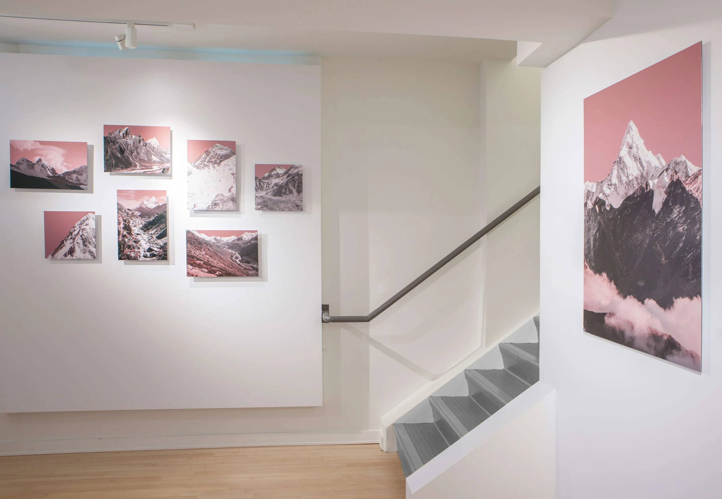


Series on exhibit, solo show, Queen Elizabeth Theatre, 2022

Anomaly iii on exhibit at the Audain Art Gallery & Museum, 2022

Anomaly ii on exhibit at the Richmond Art Gallery, 2021
Anomaly vii, 68x27 inches, limited edition of 12 This gorgeous mountainous scene was captured in the Himalayas, during the 12 day trek to Mount Everest Base Camp. The focal mountain in the compositions artwork is the back side of Mount Ama Dablam. The beautiful monochromatic landscape is infused with hues of pink with intentions to advocate for awareness of the climate impacts forecasted for this region, in Nepal.
Anomaly xvii, 60x40 inches, limited edition of 12 Contemporary artwork featuring a pink landscape of infamous Himalayan peak, Ama Dablam.The vertical composition is a change change artwork created by artist Desirée Patters, Canadian visual artist. The series Anomaly communicates global warming impacts forecasted for the Himalayas.
Anomaly v, 48x33 inches, limited edition of 12 A close up view of Mount Nuptse reveals the beautiful details of this six thousand meter peak. Coloured red and blue, this contemporary artwork was created from climate graph anomalies, and divided into thirds. The red portion of this diptych, communicates the scale of glacial loss for this coming century. The Himalayas are facing dire and far reaching effects of climate change and Canadian artist and climate activist, Desiree Patterson, is dedicated to creating photographic art that brings our awareness to these environmental and social injustices.
Anomaly i, 68x27 inches, diptych, limited edition of 12 Mount Nuptse and Mount Everest appear in this artwork created by Vancouver based photographic artist, Desiree Patterson. The artist travelled to Nepal in 2018, and hiked to Mount Everest Base Camp to create the series Anomaly, which intends to communicate the impacts of a changing climate and projected glacial loss in Himalayas.
Anomaly iii, 65x48 inches, diptych, limited edition of 12 Mount Cholatse photographed during trek to mount Everest base camp trek. Artist Desiree Patterson created series to communicate the impacts of climate change and projected glacial loss in Himalayas.
Anomaly ii, 68x48 inches, diptych, limited edition of 12 Mount Ama Dablam pictured in this contemporary art series created by vancouver based artist Desiree Patterson. The series Anomaly aims to communicate the impacts of global warming in the Himalayan region. The mountain appears divided with blue and red coloration, the later illustrating the projected glacial loss predicted for this region, this century.
Anomaly iv, 68x48 inches, limited edition of 12 Mount Everest Base Camp and the world’s highest glacier, the Khumbu Glacier, are pictured in this photographic artwork that was created by Canadian artist, Desirée Patterson. The composition reveals one third of the photography coloured red, which illustrates the glacial loss predicted for the Himalayas by 2100. The series Anomaly, aims to raise awareness of climate change in this sacred region and incite climate action.
Climate Graph: surface temperature recordings in Nepal from 1901 - 2021. Source: Ed Hawkins, National Centre for Atmospheric Science, University of Reading.Climate graph generated by scientist Ed Hawkins, from the National Centre for Atmospheric Science, at the University of Reading. He created the visual graphs to simplify the communication of complex climate recordings, using colour bars that represent global warming trends. Data for graphs compiled from: Berkeley Earth, NOAA, UK Met Office, MeteoSwiss, DWD
Anomaly xi, 48x32 inches, limited edition of 12 Pretty in pink this dreamy landscape depicting mountain peaks found during the EBC trek in the Himalayas, features dramatic lighting and towering clouds swarming over the jagged peak of Ama Dablam, viewed from the backside.
Anomaly xii, 24x24 inches, diptych, limited edition of 12 Square artwork of Himalayan mountain close-up photograph overlaid in pink.
Anomaly xiv, 36x36 inches, limited edition of 12 Detail photograph of Mount Ama Dablam. Pretty in pink, this square contemporary artwork highlights the fragility of the mountain in Nepal, as effort by female artist, Desirée Patterson, to advocate for their protection.
Anomaly x, 48x32 inches, limited edition of 12 Pink artwork advocating for climate change awareness for the glaciers in Nepal. This landscape artwork features a river winding forth from the infamous mountain, Ama Dablam in the back. Created by climate artist Desirée Patterson.
Anomaly xv, 40x30 inches, limited edition of 12 Mount Everest soars above the Khumbu Glacier in this pink contemporary landscape created by artist Desirée Patterson.
Anomaly viii, 60x45 inches, limited edition of 12 Mt Cholste and the Periche valley are depicted in this stunning, pink landscape. The composition is apart of the contemporary photographic series created by artist Desirée Patterson, that advocates for awareness of climate change and the dire impacts coming to the Himalayas.
Anomaly ix, 50x33 inches, limited edition of 12 Expansive view of the Dingbouce valley in Nepal captured during the 12 day trek to Mount Everest base camp. The view is monochromatic in hues of pink with intentions to advocate for the endangered glaciers of the region. This climate change inspired artwork is created by Vancouver based visual artist, Desirée Patterson.
Anomaly vi, 30x40 inches, limited edition of 12Mount Ama Dablam pictured in this contemporary art series created by vancouver based artist Desiree Patterson. The series Anomaly aims to communicate the impacts of global warming in the Himalayan region. The mountain appears divided with blue and red coloration, the later illustrating the projected glacial loss predicted for this region, this century.
Series on exhibit, solo show, Queen Elizabeth Theatre, 2022
Anomaly iii on exhibit at the Audain Art Gallery & Museum, 2022
Anomaly ii on exhibit at the Richmond Art Gallery, 2021
info
/
1
2
3
4
5
6
7
8
9
10
11
12
13
14
15
16
17
18
19
20
21
22
23
24
·
·
·
·
·
·
·
·
·
·
·
·
·
·
·
·
·
·
·
·
·
·
·
·